Thursday, December 1, 2011

Weekly IP Blog#11


What I did
Sat. 11/26/11: 2.5 hours in the library researching and checking out books.

Sun. 11/27/11: 5.5 hours sketching and drawing out volcanic eruptions.

Tues. 11/29/11: 2 hours researching new printing paper, getting samples from B&Hh Photo Video and talked to representatives about printing options. 1 hour and 25min scanning high quality files of my best sketches. Read about volcanic myths, studied geological images, and digitally painted for about 4 hours.

Weds. 11/30/11:  2 hours studying digital fire and lava effects, practiced digitally painting, and read more about volcanoes. Continued to digitally paint more drafts and printed off work, about 5 hours.

Thurs 12/1/11: Had in class group critique and feed back. About 2 hours writing my blog, and 1 hour and 45min reflecting and thinking of words and phrase that inspired my natural disasters.


What I accomplished/discovered/encountered
I worked hard over the break and this week to get a volcano ready in time  for my December review. I’ve looked at books, online images, read stories, and studied digital effects that inspire me to get the kind of impacting look my volcanic eruption needs. In sketching out compositions in pastel, scanning them, and painting over them digitally, I’ve discovered two styles I’m having based off my process. The first style allows more of my hand drawings to show more, depicting my drawn textures with less obvious digital effects. The second style takes me a lot more time to do because I paint over almost my entire drawing, or sketches that I’ve merged together; to get an interesting digitalized vantage point. I think the digital style is most successful in having the potential in really impacting and immersing an audience to the idea that natural disasters are petrifying yet beautiful. 

I went to the library over the weekend and found 
amazing books, full of great geological images, others with facts and stories of how our earth has been formed, and some with inspiring illustrations and Japanese styles. One book in particular that has been extremely helpful is The Red Volcanoes : face to face with the mountains of fire, with photographs by G. Brad Lewis and Paul-Edouard Bernard de Lajartre ; introduced by John P. Lockwood and Alain Gerente. It’s full of amazing photos of the volcanoes in Hawaii and Reunion, shares great volcanic facts, and even touches on the Hawaiian legends about Pele, the fire Goddesses. I’ve learned that  more active volcanoes are mainly located on the boundaries of the tectonic plates, when in contrast hotspots are not linked with plate 
boundaries; these things are taken into account when photographing lava. The volcanoes that we see in photographs a lot allow people to observe them at a safe distance, and those are called effusive volcanoes. I’ve been reading on the naming of the volcanoes as well, how Kilavea refers to the rising leaves of the ti plants-referencing to the visual of lava fumes. This book really inspired me, I loved the stories and that made me imagine muddy flows and dough like connotations I did not originally relate to lava before. I loved the deep purples and smoky colors in the photos, a lot of the cracks in rocks with lava reminded me of blood veins, and for some reason Lord of the Rings. This book also pushed me to investigate the international volcanologist Jack Lockwood, who has a very interesting website that even offers his services as volcanologist! I had no idea that people could even do that. Another book that visually inspiring me to paint my volcano more digitally was Volcano : a visual guide, by Donovan-O'Meara, Donna. It really made me imagine what being in the ring of fire must feel like, hot and mystical, even though it not didn’t have actual pictures of the location itself-it just made me think of it. This lead me to the overpowering feeling I wanted my volcano to have, yet try to make it bright and seductive. 

Painting rocky textures in both my hand drawings and digital drafts was difficult; very different form the watery and flowy strokes I’ve been working with over the last couple weeks for my hurricane. I had to try it over and over, sketch out and play with just making rock textures more realistic on my own before jumping into drawing out a volcanic scene. My first couple of sketches were kind of cliché, something you would see in a dinosaur book.  I did however like the spiciness I created with the reds, yellows, and oranges I needed in order to make my own lava mess in my drawing pad. Some of weaker sketches and  reminded me of cigarette buds or dirty ash trays, which I thought was odd to connect to hurricanes and nature, but I did manage to correlate them in shadows of my more successful volcano sketches. I also found this great online Volcano Blog, full of awesome art. I particularly found the painting by Joseph Wright very powerful in how serene it was for being a volcano, especially since it was a volcano found in Italy and one he himself did not witness.  
‘Vesuvius from Portici’,  Joseph Wright of Derby 

My digitally painted volcano, style #1 
My digitally painted volcano, style #2 


Also this week I looked into more printing options for my final products. James suggested last week to look up translucent or Mylar ink jet paper at B&H Photo Video. I chatted with an employee and they kept referring me to other kinds of photo paper that only came in 8.5x11, they also told me they do not give out samples or sample packs of the kind of paper I was interested in. This reminded me of the Fuji Flex paper sample I got in the mail a while ago, that looks like Mylar, but I’ve yet to get some to print with. On Wednesday, after looking more paper options with B&H, at Kinkos I explored printing on a type of overhead paper to see what it would look like. I liked the transparency, but my colors got a bit lost and the work overall got darker. The larger print I did 36x42 in black and white, and this time with the higher quality scans the print was not as broken and low quality as my last hurricane large print was. So the higher quality scans that take me a while to do at the GroundWorks are really paying off.

Thursday’s small group critique was very again very helpful and encouraging. I learned that my digital style has the potential in being emissive and impacting if I keep the quality to come through the prints. They look the best on screen, but almost photographic when I printed one of my works on the overhead type paper for the critique. I was also encouraged to post words and phrases I’m reading that are inspiring me to paint my natural disasters digitally, especially the Spanish poems I read about in regards to hurricanes. I think that putting words/phrases next to my work, and rethinking what they mean to me and why, will really help me others understand what it is specifically my work can communicate. Having written down important words and phrase already that provoked my visual motivation, has helped a lot already. We also discussed different printing methods for my project, Im still experimenting with different paper and options to invest in further exploration that might be better than printing on glass.

What I think I should do next
Next week I will be doing more reading and research for both volcanoes and hurricanes, I found more and still have not gotten through it all. I hope to order printing paper samples of translucent printing paper to experiment with; James has offered to help me with that. I also heard oiling thin paper could work so I’m going to try to learn more about that.  I will write on note cards the phrases and words that inspired my large prints, step back and reflect on their meanings and how they can connect to my digital work better.

Work I will have completed for December Review
I hope to have at lest two large digital prints of my best volcano and hurricane so far. I will also have at least 4 different printing samples of how my work could be presented, some will be the practice prints I’ve already done and others will be the new ones I am going to try to get in the next in couple of weeks. I also plan on bring to the review all the samples of paper and glass I’ve gotten mailed to me. The tornado prints I’ve done a while I want to present as well, so I’m hoping to have some time to fix them so that they correlate better with the volcano and hurricane I’ve been working on. I might also provide a list of the words and phrases from my research that have inspired some of my work.

Thursday, November 17, 2011

Weekly IP Blog#10


What I did
Sun. 11/13/11: 4 hours reading, 2.5 hours drawing
Read about Greek, Roman, Mayan, Dominican Republic, African, and witchcraft stories, Gods, and historical legends in relation to hurricanes. Drew hurricanes based on these stories and descriptions of storms/Deities. 

Mon. 11/14/11: 2 hours, 45min
Read more articles and stories about hurricanes, how witchcraft and the religious descriptions of hurricanes and their positive power in bringing change can refer to “The Eye of God”. Found more cultural characteristics of hurricanes being parallel to storm Gods and Goddesses. Drew smaller compositions of hurricanes.

Tue. 11/15/11: 5 hours
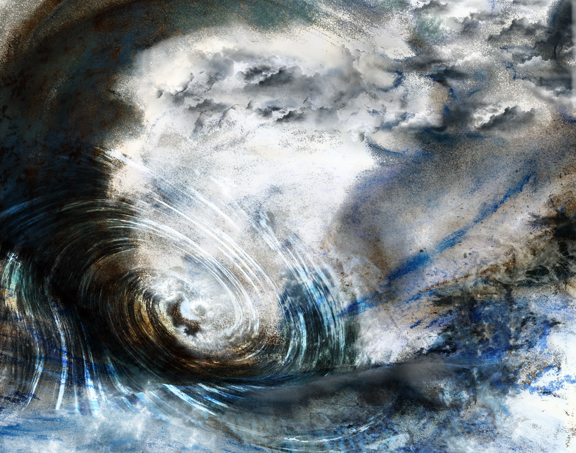
Researched more on hurricanes, found great poetry and storybooks about hurricanes at the library. Drew more hurricanes, started working digitally and exploring the new digital effects. Scanned my work and continue reading scientific and weather descriptions of hurricanes. Watched clips about hurricanes and storm surges.

Weds. 11/16/11: 4 hours
Digitally painted hurricanes based off my sketches. Printed my best draft and work, continued reading poems in Spanish describing hurricanes.   

Thurs. 11/17/11: 1.5 hours blogging/reflecting, 3 hours rescanning and editing work, 3 hours in small group critique. 

What I accomplished/discovered/encountered
I was really busy this week, hurricanes was my craze! I had a lot of fun finally getting more reading and research done in regards to hurricanes. One huge thing I learned overall about reading so many different accounts, meanings, poems, and stories about hurricanes is that Americans have the tendency, out of all other cultures, to look at hurricanes so negatively. Japan, Latin America, and even Africa described hurricanes in terms of strength and positives change in beautiful ways. I especially enjoyed the European relations of storms to magic and witchcraft, how winds and the intensity of storms signified an invisible person’s power or hierarchy. These readings really helped me get inspired to envision windy mists, boiling foam, and coils of storms.

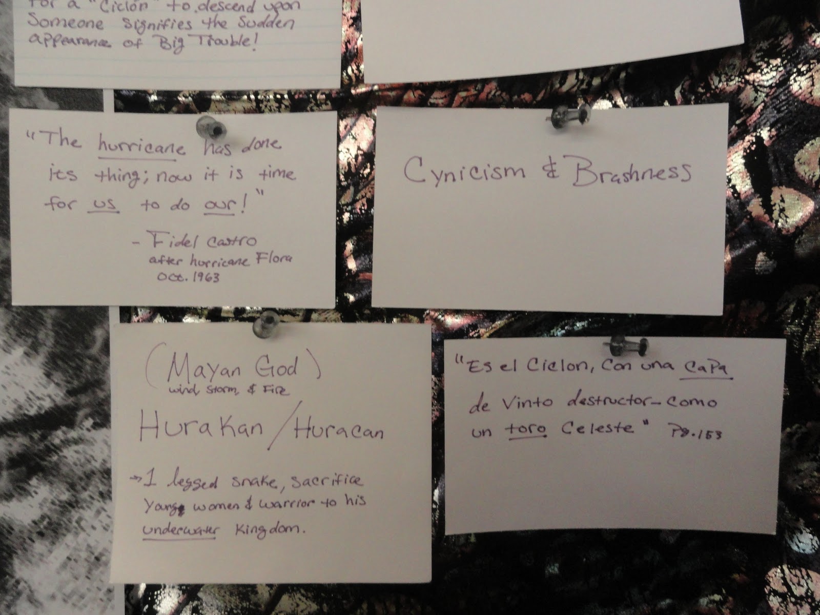
Another thing I really enjoyed reading about this week was the Mayan and Latin American material about hurricanes. The word we use today, “hurricane”, derives from the Mayan word “Hurakan” which is the name of the Mayan storm God. To prevent hurricanes, the Mayans would sacrifice every year a young women and warrior to lead her to Hurakan’s underwater kingdom. Hurakan’s power as a God also related to the powers of the Greek God Aeolus, but I found Hurakan’s snake form and spiritually much more impacting. When I revisted the Art and Architecture library Tuesday, I found this amazing book called the “Wind of Change & the Transformation of Nineteen-Century Cuba”, written by Louis A. Perez Jr. It’s getting really frustrating finding mostly books in the libraries that are just about the math and scientific descriptions of hurricanes, so this book was a great find. It has amazing cultural connotations and meanings for hurricanes, and best of all poems are in Spanish! I absolutely loved the new descriptions I was reading about in the poems, how Fidel Castro inspired people to be like a hurricane in fighting, how a hurricane was related to a bull, or how women can be described like a hurricane in having great hips and being good at dancing. The Spanish language has more description words/adjectives than the English language, so the variations in how hurricanes were being descried in these Spanish poems was amazing and more much relatable to me. New words that were being used in these poems for hurricanes were whimsical, playful, brashness, and cynicism. This really inspired me to draw a lot more this week.

I also got this great book “Weather Whys” by Yeager, Paul. I just recently got it, but so far the poems about storms are calm and talk about needed changes in nature. Having actual books really does help, and the other digital books I had been reading that were much more scientific with images tired me out more. I like carrying books around and taking a good break away from my laptop. I did also however learn more about the National oceanic and Atmospheric Administration in the US and how they help regulate hurricane tracking and public safety. The fallowing clip was really informational and visually helpful in understanding how dirty a storm surge can be. http://oceantoday.noaa.gov/hurricanestormsurge/welcome.html

Sketching more this week based on new reading material was a lot more enjoyable and refreshing. I think I kept having the tendency of drawing faster but more abstract because of a lot of the things I was reading that were were more magical and less tangible. Wind and messy mists with foamy clouds is what I kept in mind, but I tired to keep my work recognizable for a hurricane and did this more successfully digitally. I discovered that what people and stories most identified hurricanes with was indeed the “eye” or the spiral the drives it, therefore I tried to incorporate that form in my work.


Thursday’s small group critique was more assuring and again very helpful this week. I printed a 36”x36” black and white version of one of the digitally painted hurricanes I created. I got fed back that my digital painting was a lot better in being identified as a hurricane, a storm with interesting intensity. A critique I had was that I needed to incorporate the digital work and hand drawn work a bit better. We talked about me fine tuning one or two of my works that I’ve sketched/digitally painted the best. A huge thing that’s affecting my work was not having high quality scans of my drawing to work with, it was something I honestly had not considered. James told me to play with the DPI and scanner settings to improve my printing quality. We also discussed cheaper printing tests I can do so that people could get a better idea of what I want my prints to look like, I can try to print colored versions of my work on inkjet Mylar and glue it on a used big piece of glass. I’m just worried about cost still, the black and white print was $12 dollars, but a colored print in that size was going to be around $80 dollars so ordering inkjet Mylar or any large sized paper is not going to be cheap for me to experiment with. 

I rescanned my best drawings at the Dudestadt Center and took a very long time doing so after my small group critique. I played with the settings and got really good scans that made my files super big so I had issues getting them on my laptop. I’m just hoping that they can be manageable on Photoshop with the effects I created because those files were big on there own already. I learned a lot about scanner settings and the people at the Dude were really nice.

What I think I should do next
For next week I want to fine-tune some of my best versions, integrating my hand drawn and digitally style better. I will also continue reading about hurricanes and stories; I’ve put some more books on reserve at the library and should be getting them soon. I will also be looking into more ways I can test print my work, see how much inkjet Mylar or other paper will cost me. I’m also tempted to work on my volcanic eruption natural disaster. I want to work on that a bit and switch gears but I’ll see what else I need to push to make my hurricane more successful. 
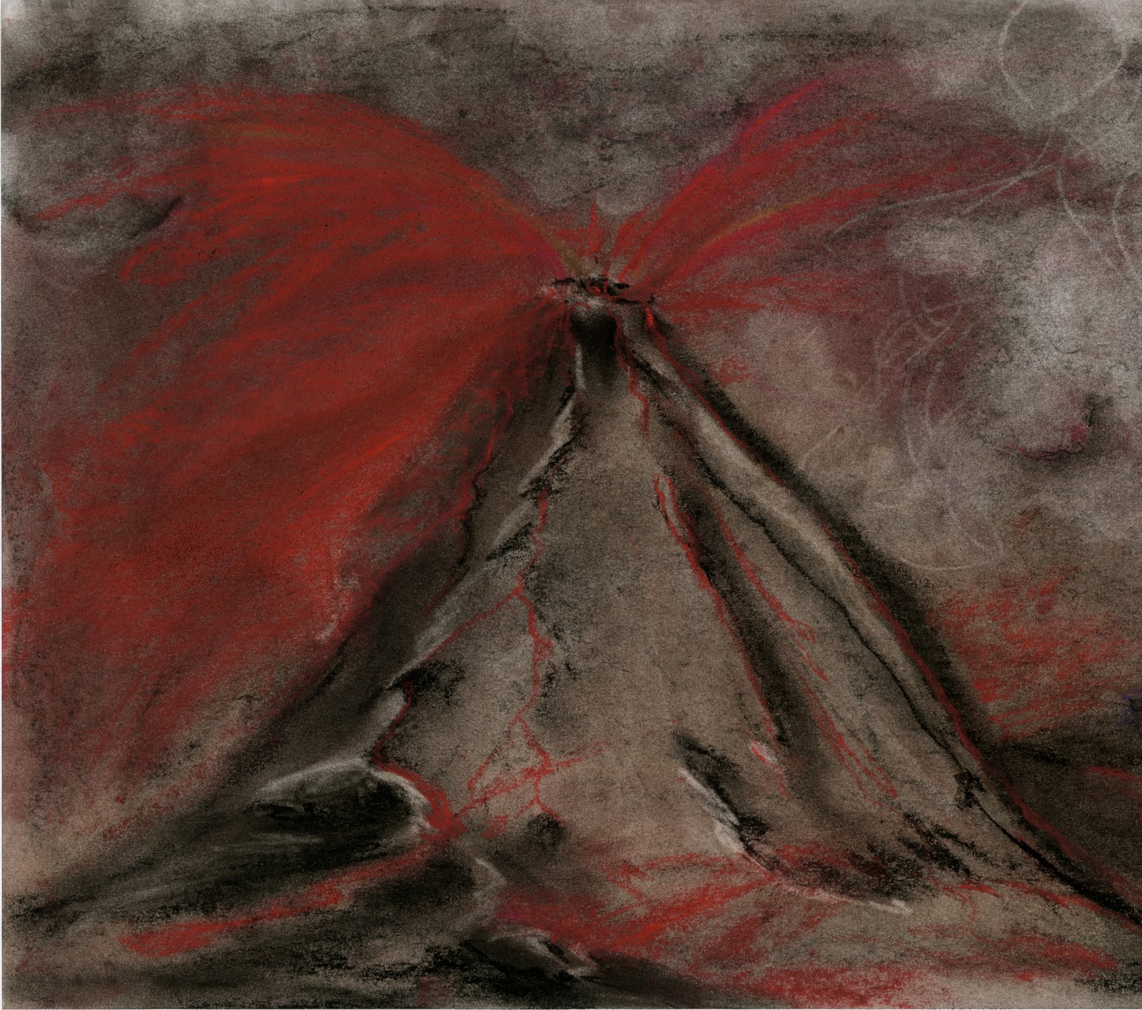


Thursday, November 10, 2011

Weekly Blog #9


What I did
Sat. 11/5/11: 2.5 hours
Wrote timeline and grant application rough draft for my IP project.

Sun. 11/6/11: 2 hours 45min.
Sketched out tsunami and hurricanes with pastels, sketched out new compositions.

Tues. 11/ 8/11: 2 hour working on IP grant application and budgeting research. 4.5 hours sketching out more hurricane drawings and watching storm footage online.

Weds. 11/9/11: 2.5 hours
Finished more hurricane drawings, scanned them, and explored new digital effects I can make based on my sketches.

Thurs. 10/11/11: 3 hours and 45min
Had in class clique, got encouraging comments on the new drawings I created. I learned what other directions I could take my drawing and research in. Edited and finished my IP grant application. Met with Juliet to review my application, got great feedback and help.

What I accomplished/discovered/encountered
In filling out my second grant application along with more intensive drawing studies on hurricanes and tsunamis, this week was more tiresome. I worked hard to improve my drawing skills and at the same time get as much accurate information about the expenses my project will have. It took a while to hear back from so many different printing companies, but I learned more about shipping options, such as having one box hold two prints being cheaper than having each one packaged separately. I also got samples of glass and paper delivered to me today and I am very excited to experiment with them and receive more.

In drafting out new drawings and trying to capture more interesting vantage points, I practice capturing more water depth. I continued more work on Tuesday and researched only hurricanes more intensely. I watched new clips online about being in a hurricane and how they are formed, discovering important facts like winds over 39 miles per hour is a tropical storm, over 74 miles per hour is a hurricane, and how the most crucial part of the storm is the eye. That helped me realize that my drawing where missing that fierce wind aspect that hurricanes have. They are a lot more in common to tornados in colors and central formation than I had originally thought. In presenting and reflecting on what I did to better draw my storms, during my in class critique, it felt good to hear that my skills are improving. My peers liked my work this week a lot more than the last and encouraged me to keep going, we all still feel that there is a strong “natural disasters” identifying element my studies still need but are closer to having.  My color exploration is better and more intensity this week in my mock-ups is helping me move forward. Below are some of my better sketches and digital explorations from this week.


In the researched I managed to do here and there, I found stories and titles of movies based on natural disasters. I saw this odd movie trailer called “Storm Warriors” that seemed to stretch the notion of storms and its powers in a corny way. "The Storm Warriors" I also found out about this fun kids book series called “Storm Runners” and it is about this kid and his farther chasing down tornados, hurricanes, and other storms around the U.S. It was interesting to read how much teens really like the book and how this topic of natural disaster is being introduced as something cool to read about as an adventure. Overall with the in class critique, research, and drawings I understood that I need to capture elements in nature that identify a natural disaster, not just elements or bits and pieces of nature.  

What I think I should do next
I need to push myself in new directions and get inspired more to get my making to next level. So for next week I will further read more and expand my research into myths, legends, dreams, and symbolism hurricanes have. I need to further understand what makes natural disasters a phenomenon that stands out from our average weather or seasonal changes. I will be continue drawing and explore more my digital effects under the influence of my research. Also playing around with samples of glass and paper I got from the printers is what I plan to do this week. 


Thursday, November 3, 2011

Weekly IP Blog#8


What I did
Sun. 10/30/11: 3 hours
Explored different mediums to make realistic water storms. Drew out tsunamis and hurricanes in pastel, explored working in this medium by making rough drafts.

Mon. 10/31/11: 1.5 hours researching printing services that print on plexiglass and sent them emails explaining my project. 3 hours filling out paper work for the Arts at Michigan Mini Grant.

Tues. 11/1/11: 4 hours
Further researched different printing methods for my project. Got quotes from different printing companies and ordered samples. Learned about shipping costs, mounting options, and discovered Fujiflex paper was another good option to print with.

Weds. 11/2/11: 1.5 hours
Finished my pastel drawings of a tsunamis and hurricanes, scanned them so I could see them on a projector.

Thurs. 11/3/11: 3 hours 25min
Presented my drawings and projected them in class to get feedback. Finished and submitted my application for the Arts at Michigan Mini Grant.

What I accomplished/discovered/encountered
I really got to explore different mediums on Sunday to draw my natural disasters in a more finished and realistic fashion. Pastels were the most successful medium for the water effects I needed to create and I made rough drafts of storms in order to get the proper feel for the medium. I explored the effects different kinds of erasers could help me create, such as the cloudy misty look waves have. It was very liberating working with messier pastels. I really enjoyed exploring this medium because it had been a while since I last worked with pastels and I was excited to combine this kind of look with my digital effects. 


Filling out grant paper work this week and researching different printing methods was hard at first, but it really got me excited about working harder to make my project a reality. I felt really professional calling and emailing different printers about my project, even ordering samples of glass and paper was motivating. They were pretty helpful by offering small student discounts, but some were very blunt about how expensive it will be to ship and print my work on plexiglass. I learned about other printing methods while exploring printing costs, realizing how my intensions and research are really about using new cutting edge technology in printing, so that’s pretty cool. One of the best printers I’ve been in contact with this week is Stephanie Maus from Artisan Colour Inc. and she was even familiar with the Ann Arbor area. She told me about this great polyester based paper called FujiFlex paper, and how that would give a similar lighting transparency effect printing on glass has. She explained how I could print my work on that paper and then have it mounted on glass, as well as other options I have in dimensions based on my budget. She told me to look at Peter Lik’s immersive landscape prints on FujiFlex paper and that was really inspiring.  His work was very beautiful and immersive, something my digital prints need to be. I loved his mystical use of color because they created an wondrous space and time as if I were looking into a different world.  

Peter Lik http://www.lostateminor.com/peter-lik/
Based on my research I learned Miami, California, and Arizona are the best places so far that could help me print my work on glass because its such a rare service. One 40x60’’ print with PROLAB Digital Imaging in California is $753.00, then I would have to pay $125 for a crate to ship them in, and shipping would be between $200-230 dollars. Artisan Colour Inc. gave me a better quote, a 40x60” print would be $263, shipping for two prints is about $165 but that would include the box they would be shipped in. I really would love to get at least 3  40x60” prints for my show, and am considering combining similar natural disasters to one print. I worked really hard this week to explain my research and justify why I should be awarded the grants I’m applying for.    

What I think I should do next
I will be working on creating more immersive drawings and vantage points for my natural disasters. I will be applying for more grants and setting up a Kickstarter account to get more funding. I’ll work on designing more intricate drawings and continue working with pastels. 


Thursday, October 27, 2011

Weekly IP Blog#7


What I did
Sun. 10/23/11: 3 hours
Sketched out tsunamis, hurricanes, and water storms.

Mon. 10/24/11: 2 hours
Watched personal stories about being in a hurricane and the show “Twist of Fate” on the weather channel.

Tues. 10/25/11: For 45min I met with Janie Paul, she helped point my sketches in the right direction and gave me great feedback. Finished sketching out and researched more stories in my studio for about 3 hours.

Thurs. 10/27/11: about 3 hours of in class critiques on my sketches, and talked about our grant applications. About 1 hour planning out a realistic water storm sketch.

What I accomplished/discovered/encountered
On Sunday, sketching out new vantage points of water storms was a bit difficult. It all came out pretty abstract and I was not sure how to capture the fierceness and easy identification of the storm all at the same time. I did enjoy exploring liquidly motions and actions in my drawings.  I concentrated more on the movements and shapes than the storms themselves this time and played with strips of my drawings being hung and the ceiling. Hanging them was interesting, but the drawings themselves needed to be a lot more finished and impacting. I think I’m trying to get too much work done for all the storms, and not concentrating enough on pushing more quality into one direction.


Monday was fun because I was flipping through channels and I ended watching the weather channel and a pretty cool show called “Twist of Fate”. The episode was about a mother and her daughter being trapped on top of a car with three babies because of a hurricane that had hit their home. I had been hearing a lot about natural disasters over the weekend, such as the small earthquake that took place in San Francisco and how Hurricane Rina surpassingly developing this week near Florida and the Yucatan Peninsula. I also watched a show about the crazy Kauai hurricane that hit the Hawaiian Islands during the filming of “Jurassic Park”. I had no idea that a hurricane had ruined the film set and how Steven Spielberg and his crew experienced such an event. I really like the movie, but seeing how the waves and air affected both the land and people was very interesting. The wind was something that really scared them, not so much the water, and that kind of surprised me. http://acrossthepondandbackagain.wordpress.com/2011/03/10/paper-and-lace/


On Tuesday I met with Janie Paul and shared with my ideas and sketches of my Natural disasters. She gave me great advice because she knows my working tendencies from having me in her classes over the years. She brought up the point that I was abstracting the storms too much. She told me to first draw out the natural disasters realistically, maybe in other mediums, and then start abstracting them. I learned that my sketches were too pretty but that they sort of looked like dancing as well, which was interesting to hear because I’m currently taking a ballet history course. Janie was really encouraging really liked my ideas for my project. I need to step back and draw better my natural disasters and not rush so much to get them all produced at once.  I also sketched out some more Tuesday in a more explosive style, it was fun to do but needed to be pushed more. I also found during my research this great article of paper storm recreations and that was really inspiring because of the light effects the paper had that made it seem a bit realistic.

Thursday in class critique was good because I got to share the feedback I got from Janie and hear how others agreed or add other suggestions. I got really encouraged to draw a nice sketch of a natural disaster and to blow up real big so people can see it. I need to explore how much of an impact and change scale can have on my sketches. It was nice to hear how people want to see my sketches bigger and better because it helps me be motivated. I also learned that some of the forms and movements of liquid that I was exploring could also be used to draw out lava because some people thought that was what I originally drew. I’m learning how a lot more of the properties of the storms and natural disaster are crossing over each other, so I have to be more carful with that.

What I think I should do next
This week I plane to draw a hurricane or tsunami, maybe both combined, in a more realistic fashion. I’m going to slow down a bit, study the actual forms of the storm and not concentrate so much on manipulating or magnifying their beauty just yet. I also plan on working on my grant application, especially the Arts at Michigan application I’ve started because its due next week.