Thursday, March 22, 2012

Weekly IP Blog#21

What I did

Sun. 3/18/12: 2.5 hours digitally painting my volcano.

Mon. 3/19/12: 7 hours digitally painting my volcano and made edits. Got feedback from my digital painting tutor at CCS. 

Tues. 3/20/12: Met with James to go over my volcano edits and quality, also went over my printing plans. Visited G & B Graphics in Ann Arbor to see a test print of my hurricane. For about an hour we discussed princes, printing options, sizes, and the possibility of having a light source for each of my prints. 

Weds. 2/21/12: About 7.5 hours digital painting and reworking all three of my natural disasters. Got feedback on my edits from fellow discerns online.

Thurs. 2/22/12: Had small group critique, discussed color and texture edits on my series to make the three more cohesive. We went over the display order of my prints and the possibility of having text/words between my prints. Spoke with Mark and G & B Graphics about printing options for friday and the timeline I have to get my project printed. 

What I accomplished/discovered/encountered

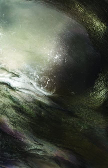
This week I worked really hard to meet my deadline with the placing the order of my prints with  G & B Graphics friday. I spent most of the beginning of this week reflecting on what was making my volcano edits so flat. The other problem I was facing was that it had the danger of just looking like an explosion if my lava and rock textures were not incorporated accurately. I spent a lot of time, mostly monday and tuesday getting those details down. Fortunately I got my volcano at the recognizable and impacting level I wanted. I got a lot of feed back over the course of this week on what odd shapes or textures people could see in all my natural disasters. For example some of the designer giving me feedback saw a human figure or baby in the smoke that the volcano produce, so things like that edited and shapes I reworked as well. 

Feedback during IP this week was also very helpful. James came to my studio on Tuesday and we went over the volcano edits I had made. I learned my background got better, but that more bright yellow and whites still could really push the lava over the red more. I also arranged to drive out to G & B Graphics and met Kevin for the first time. He was extremly helpful and is getting my prints mounted onto plexiglass for half the prices I was looking at with other printers. He also did a test print off my hurricane and we compared it other printing options. We really liked how the test print looked on a light table, so we are going to try to get florescent lights for my prints. G & B Graphics is also printing my project larger than any of the other printers would, 49"x61" with lights or 46"x58" with an inch of plexiglass showing as a border. I heard today that they could mostly likely get the lights for me, so tomorrow I will be visiting them again and look over prices again.

Thursday's small group critique was one I really needed. I learned that I can relax a bit more about printing my project. I was really worried that my test prints or blowing up the scale of my prices would cause issues, so I wanted to dedicate all next week to leave to make edits and deal with mistakes. Presenting all three of my natural disasters during my small group cirque was great became we discussed the display order in which my prints could go in. We reflected my hurricane vertically to see it how it compares to the volcano and tornado and having the wave come in and point to them from the left helped a lot. I also learned about some correlations the tornado and hurricane have with colors and lines. I need to make edits to the color pallet of the hurricane and line textures, as well as be more carful keep the three related to each other enough to make a successful series. Hannah also brought up the point of how I could incorporate text or words in my final presentation based on my research. I was at first confused and imaged gallery labels for between each large print, but then I understood how helpful having text or complementary quotes would help viewers look at and understand my work better. I can see how this can help, so I will consider the option with the final printing display and time I have left. Im excited and worried about getting my project printed, but I've worked really hard to get where I am with them. Below is the order I am thinking about putting my prints in for the IP show. 


This week was also a bit crazy because outside of printing because my laptop died. I had to purchase a new Mac to safe my project and all other work. Im happy now that I managed to catch up to where I wanted to be at the end of the week, but on tuesday and Wednesday when I had serious computer issues was terrible. I finally can run Photoshop CS5 normally and get my work done, Im just a bit worn out by trying to make up for the lost time. 


What I think I should do next
Tomorrow I will be going to G & B Graphics to start some test prints of my work and place the order of my tornado to be printed fully. I will also be looking at the lighting options they are offering, repricing my entire project as well and discuss how to give them credit on my post cards. Im excited to have lights come through my prints that will be mounted onto plexiglass, Im just hoping it all works out! I also plan on playing around with a way to have words presented with my prints at the show. Another think people told was cool to maybe have at the show was a quick stop motion clip or photos of all the laying and digital painting process that goes into making the complex natural disasters I created. A lot people are just amazed at the different transformations that happens when I go in and edit different layers or repaint a section of my work, so that were I get a lot ask me more about my project and working process. 

Thursday, March 15, 2012

Weekly IP Blog#20


What I did
Sat.  3/10/12: 1.5 hours talking to printers, getting better discounts and plexiglass options. 2 hours digitally painting my volcano.

Sun. 3/11/12: 3.5 hours digitally painting.

Mon. 3/12/12: finished my SAS Grant application.

Tues. 3/13/12: Spoke with Stephanie and Juliet about my new volcano’s perspective. Talked more with Kevin from G & B Graphics about better printing options and emailed him some files of my work. Talked to Sign and Stuff and got new printing quote.

Weds. 2/14/12: 2 hours digitally painting and getting feedback from others on how my volcano drafts differ. Learned what aspects to keep and get rid off.

Thurs. 2/15/12: Meet with Mark to talk more in depth about my project and how we can get my prints set up and mounted on the walls. Heard from Kevin about using new banner material for printing to get cheaper price and more transparency. Reflected 2 hours on my work this week and printing order options.  

What I accomplished/discovered/encountered
Nearing the end of my project really hit me this week. I’ve been in contact with two of my top printing companies, G & B Graphics and Sign and Stuff. They are both doing what they can to get my prints on 40x60 on plexiglass. G & B Graphics is the nicest and the cheapest so far, giving me a new quote today of $126 per print! They want to use a translucent banner material and use adhesive to get it on plexiglass, they will be running a test print for this weekend and I will be visiting them Monday or Tuesday of next week. I feel much better with these cheaper, and kinder, printing companies.  Paragon was too expensive for what they were offering me, just photo paper prints mounted onto plexiglass. Sign and Stuff wants to use vinyl printing paper that already has adhesive on the back, causing the glass to be set behind the print but also be more expensive. Each print with the plexiglass behind would be about $244 each, saw cut sides, and $20 per test print. I think having the glass behind the prints would be neat, especially with vinyl paper but Im still unsure about it. G & B Graphics has the risk of having bubbles on my work, but that’s because they are using the cheapest methods to help me out. The test print from them will defiantly determine if their method will work! If not, Sign and Stuff will have to do.

Working on the final of my volcano has been both exciting and difficult this week. I got feedback from Doug Hesseltine, learning not to overwork my volcano! Doug and others I’ve been asking for feedback all week like how the perspective of the volcano is not obvious. I think keeping it like that will help my volcano being cheesy. People really like my fire effects and glowing textures I created. Im working my very best to get my volcano done and final edits on my hurricane completed! I can’t wait to see all three of my prints done; even thinking of the test prints is giving me goose bumps.

I discovered that taking away the hole and sky from my volcano is more interesting and less confusing. I needed to work more on my foreground and background aspects. Stephanie and Juliet were very helpful Tuesday giving me advice on what looking down at the volcano would do instead of looking out from inside it. That’s what Im still working on, I think my most recent version below has the yellow sparks too overworked in the attempt to put the fire and explosion more in the foreground. I know what I have to do to push back the rock textures and fire forward with shadows; it’s just harder to actually paint. Im doing my best to get my volcano where it needs to be!


I spoke Mark Nielsen today about my final work. He’s known what I’ve wanted to do and liked the new printing options I’ve been looking into. We talked again about the screws that would give my prints 1inch and ½ space from the walls. He is not totally against the bolts the printers are offering for mounting my prints on the wall, but the screws sound like a cleaner option. Also submitting my SAS grant application was a great accomplishment today in stretching for final printing funds.


What I think I should do next
I’m already planning to have prints ordered by next Friday. Im leaving a week to get all three of my natural disasters test printed, checked, and finished before April 1st. That way if anything goes wrong, I’ve got time to fix it. The colors are what I’m worried about, so not matter what I will be paying for test prints to get done. So I plan to have my volcano finished by the middle of next week, showing all three of my natural disasters next Thursday for a final critique. Im going to digitally paint even more now, but take more breaks so that I don’t over work my volcano. Speaking to Mark today was also great! I’m going to keep him posted on the printers I decide to go with the mounting options. I also plan on making a request for showing my work at Work Ann Arbor, the window space would really complement my prints. Super excited to get my volcano done, Im motivated and ready to get my natural disasters printed. 


Thursday, March 8, 2012

Weekly IP Blog#19

What I did
Sat.  3/3/12: About 4.5 hours rewriting my thesis, made some changes to my research. 1 hour and 45min working on my SAS grant application for printing my project. 

Sun. 3/4/12: 3 hours and 25min finishing the second draft of my thesis.  Reworked my volcano digital painting for about 1.5 hours.

Mon. 3/5/12: 4 hours digitally painting 3 versions of my volcano. Explored new perspectives and lighting ideas. 

Tues. 3/6/12: Spoke with Stephanie, Hannah, and Juliet about my new volcano drafts. Made a trip to Paragon Display Group Quotes and spent about an hour and half looking at their pricing and printing options for my project. They are pretty expensive even with the student discount. 1 hour editing my SAS grant application. Digitally painted for about 4 hours.

Weds. 2/15/12: 2.5 hours digitally painting another versions of my volcano with a more immersive perspective. 

Thurs. 2/16/12: Got in touch with Stephanie at Artisan Colour, Inc. to compare printing options and prices again. Contacted other printing companies,  G & B Graphics. 2 hours and 45min reflecting on my work this week and printing arrangements.


What I accomplished/discovered/encountered
What I accomplished this week was getting farther on the vantage point of my volcano and completing the second draft of my thesis. I felt a better writing the second version of my thesis than the first, my thoughts just felt clearer after having pulled out my important research and points for my first draft. I’ve also been looking into more affordable printing options and complete my application for the SAS grant application to help pay for getting my project printed. It’s getting close to getting my natural disasters ready to print and I am very excited to so. 

Digitally painting this week was fun because I explored more compositions and better effects based on the work and brushes I’ve discovered over the last couple of weeks. I was playing with paper, cloth, and my lap to see plan out what new vantage point would be interesting to see my volcano that was no longer seeing it from a distance or as front shot. I discovered that it would be interesting to have a composition where the viewer is looking out from inside the volcano and seeing the top hole and outside sky. This is easier to imagine than to digitally paint, but I took on the task and came up with my compositions below. The other compositions I made this week display my volcano as seen from a distance, so this newer version was my attempt of making my volcano more immersive.  I want the feeling of tension, magnificent lighting, and walls of fire be what is felt for my volcano with beautiful but alerting “pow” from the explosion of lava. So I really worked hard Tuesday and Wednesday digitally painting my volcano with these new ideas and styles to make it more sublime.


On Tuesday I made a trip out to Paragon Display Group in Ann Arbor and went over prices and other printing options with a lady named Gen. Paragon offers great plexiglass mounting and the dibond mounting material James had recommended. The bad thing is that Paragon’s prices are really high, even with the student discount. The smallest size I am willing to print my project is 36”x46”, and for all three of my prints they quoted a total of $934.57 which is more than getting the larger prints done directly onto glass and shipping from Artisan Colour, Inc. I heard back from one of the managers at Paragon Display Group today and they are giving me more of discount but at the smaller size of 30”x40” for about $646.28. So far I don’t think I can order my prints at Paragon and with Artisan Colour, Inc. in Arizona I have the huge risk of me not having more control about the color of my prints and less time to finish my volcano. I plan on looking more into other printing companies that will at least print my work at 36”x46” and get it mounted on plexiglass. Even with the SAS grant I have a budget of about $168-$170 to print my project, and that includes some of my personal money.

What I think I should do next
I plan on completing or close to completing my volcano by next week. I really need to get moving because I need to place my print orders soon, I’m setting a printing deadline for March 28th. I’ve been in contact with other printers in Ann Arbor and found G & B Graphics, their reprehensive Kevin was extremely helpful today! He is going to send me quotes for printing and mounting my work this weekend. I also plan next week to get quotes from Sign Stuff in Livonia, Express Graphics in Indiana that Michigan Print, Copy, Mail recommended. There is also Britten Media in Traverse City that can help me out. I also plan on getting feedback from Janie Paul in the next couple of weeks; she has been busy and not able to plan a good time to meet. Getting feedback from different people is what I am trying to do overall and it helps getting insight on things people notice at first glance that I don’t.    

Thursday, February 23, 2012

Weekly IP Blog#18

What I did
Sun.  2/12/12: About 4.5 hours redesigning my volcano. About 1 hour taking photos outside of rocks and earth textures to create new Photoshop brushes with.
 
Mon. 2/13/12: 2 hours researching rock and mountain textures, recreated more my volcano texture. 
   
Tues. 2/14/12: Spoke with Janie Paul about reviewing my whole project again. Got more pointers from my tutor from the College of creative studies, reworked more of my effects on fire lighting for about 3 hours and 45min.

Weds. 2/15/12: 2.5 hours digitally painting and recreating a draft of my volcano that got corrupted.

Thurs. 2/16/12: about 2 hours sketching new vantage points for my volcano and reflected on my work this week by writing my blog. 

What I accomplished/discovered/encountered
I’ve spent a lot of time trying to understand how I can capture more rocky textures in my digital paintings. I think the danger in recreating my volcano is how cheesy the rocks and fire can look together. This is why I think Peter Lik and Edward Burtynsky’s work I keep referencing are so helpful in how they both reface the power of proper natural lighting when they photograph. They also use magentas, violets, and warm browns in some of their photos of earth’s surface. So I’ve been trying to use that color palette instead of organs and yellows with bright reds I was originally working with. 
Dryland Farming #24, Monegros County, Aragon, Spain, 2010, 

Edward Burtynsky


Peter Lik

I also found Mexican painter Patricio Betteo’s work this week and his style with post-apocalyptic landscapes very inspiring. The simplicity yet layered effects create depth and awe in his compositions. The layers also have the push and pull effect that makes the viewer sort off step into the scene. I spent sometime outside Sunday with the better weather, and took some pictures of rock and earth textures I found interesting at Hines Park near my house in Livonia. Zooming in and out at some rocks and earthy floor allowed me to get the feel of the shades of browns, grays, and blacks I could incorporate into my work. Below are some of my photos.


 I also have been in staying in touch with Janie Paul this week to get more feed back on my project together as a whole. She has been busy lately, so touching base after the break is what we have planed on. This pushed me also get in contact with my tutor from the College of Creative studies, giving me some pointers on how to recreate some new brushes in Photoshop based on the photos I took this weekend. They also gave more feedback on the how the fire effects I’ve been creating look to computerized and that they don’t need to be as harsh. When I started to use one of the new brushes I made, I corrupted the file I was working on and lost most of the work I had for that rough draft. So I wasted some time recreating that sketch again and was disappointed in not getting it exactly the same. I need to reedit the effects I had originally made to make my fire and smoke. I think not being so literal with fire and lava will help my volcano be more in the style of the sublime, sort off like my tornado. I feel that my project as a whole is taking all three natural disasters in a dreamlike realm, which is really interesting to me now seeing the three interacting.

Again the struggle I am having is creating a successful vantage point of my volcano and making it immersive. My best results for getting somewhere good in composition is drafting and recreating vantage points of my natural disasters. So Im hoping that doing this again for my volcano can be quicker based the last two natural disasters I’ve already made. I think getting away from the usual explosions seen from a distance and concentrating more the interesting shapes and tails lava can make would be a good way to go next. Looking back on this week, I realized that I spent too much worrying about textures and not enough on my compositions. I need to concentrate on that a lot more for my volcano because my sketches right now are not good enough, you cant really tell what they are.        


What I think I should do next
I need to finalize how I am going to get my project printed. I’ve tried to get in contact with my contact at Artisan Color Inc. but she seems to be on vacation. I’ve needed to go to Paragon printing here in Ann Arbor in person to see the kind of finishings and printing methods they offer, but need a car. I’ve therefore planned to go there soon with another student from another IP group to see if we can get a discount together in getting our projects printed. Next week I will be working on another draft of my thesis. I also plan to continue working on my volcano compositions and get inspired to keep working over the break. 

Thursday, February 16, 2012

Weekly IP Blog#17


What I did
Sun.  2/12/12: About 6 hours editing my hurricane’s composition and digital quality based on my small group critique. Researched for new inspirations to jump-start my volcano. 
Mon. 2/13/12: 3 hours editing the lighting and eye of my hurricane. Sketched and painted a new composition of my volcano.    
Tues. 2/14/12: Meet with Hannah to review my postcard ideas, compositions, and my hurricane edits. Reworked and came up with text options for my postcard for about 2 hours.      
Weds. 2/15/12: 4.5 hours digitally painting and sketching out two new compositions of my volcano.   
Thurs. 2/16/12: about 2 hours and 45min sketching out new aspects for my volcano and writing my weekly blog. Talked with Juliet and James for input on my postcard. 

What I accomplished/discovered/encountered
For this week, finalizing my hurricane more a success. I feel the lighting and undefined eye works a lot better than it has in any of my other versions. The textures of the water were possible with new skills and styles that I improved over the last couple of weeks by reworking my drafts over and over again. I learned a lot in reworking and creating so many rough drafts. I still need to edit the colors of the water a bit; they might hint to rocks because of the earth tones so some blues will be added. I also need to fix the background lighting behind the big wave coming in from the right as well as fix the top part it.  Overall, I’ve gotten the best feedback on this version and composition being much more immersive in setting the viewer on the water instead of an aerial view.
Taking a break from doing some final touch ups and editing on my hurricane is well needed. So retackling my volcanic eruption early this week was a good change. I’ve two compositions in mind to rework digitally. The first one, seen below, focus on the volcano opening up or exploding from the side to release all the pressure and majestic heat that it holds. My sketch is still rough, but that was an attempt in having a better vantage point that sees the volcano from afar.

The second composition sets the viewer looking into or falling in on the top most peak of the volcano. I think cropping and showing less of the top peak will help this a lot, but I’m still working on creating a proper foreground and background right now because its very flat. Creating the sort of rough roundness and mass of a volcano and the rocks is what has been tricky in creating this natural disaster. The rock textures are not that big of a problem for be me to paint, but making them look 3D and some closer to viewer than others is. I’m still working on getting the realistic effects of the rocks in place over the messy computer look it can have.


A big reference for the colors and new lava style for my volcanic eruption that I am currently using and inspired by come from last week’s research on Edward Burtynsky’s photographs. The two photos below are my favorite in color and textures, new aspects that are not fiery or ablaze. I want to incorporate the rustiness and sort of stillness his photographs have in my volcano. I think using less fire effects and more textures such as these will give my volcano more awe and make it less cheesy. Creating this new sort of style is an exciting but difficult task I will be working on for the next couple of weeks. The overwhelming composition is also something I need to explore more.
Edward Burtynsky

Lake Project, Edward Burtynsky
I also worked a lot on my postcard this week. I cropped a lot of different aspects of my tornado that I will be using to represent my work for the Senior Show. I met with Hannah and she helped me choose and make a better close up of my tornado. We also talked about the text I could incorporate and how using one of my quotes from my research could really be successful. Right now I’m still torn between these two quotes I can use:
“awe-inspiring, as a means with which to give narrative resonance to the power of natural forces and thereby placing in perspective the human place in the great scheme of things” (Pérez 150)
or
-“It developed like a thousand whirlwinds…at first like an exploratory filtration, followed by inundation, and finally a destructive force… headlong like a roaring animal…Its furious rage bellowed, hurling all the solid underwater mass, now in the form of an eruption, in an uncontrollable apocalyptical gallop…A gigantic avalanche, hurling…fumed with rage, it flared as if it were electrified as if its mysterious convulsive floor were a huge cauldron” (Pérez 150)
Doing this got me really excited for the show and motivated me more to make the last efforts to get my hurricane and volcanic eruption to an amazing level. I’m also thinking of naming my project Forces of Delightful Horror, Nature in the paradox of being beautiful yet terrifying, or Nature as an autonomous force, sublime tornado, hurricane, and volcanic eruption.

What I think I should do next
I will be continuing to on my volcano and digital style next week. The composition is the first thing I need to figure out, then the new textures and rust like lava Im inspired to create based on Edward Burtynsky’s work is next. I will also do more research on concept art and fantasy digital painting styles to help me create the foreground and background contrast Im currently having trouble depicting. I hope to research more printing options for my project as well. The cost and realality of printing my work is really sinking in and Im very aware of my time.   


Thursday, February 9, 2012

Weekly IP Blog#16


What I did
Sat.  2/4/12: 4.5 hours painting and sketching more immersive compositions. Researched more reference paintings.  

Sun. 2/5/12: About 1 hour and 20min. studying, Manufactured Landscapes: The Photographs of Edward Burtynsky and David Maisel: The Lake Project.

Mon. 2/6/12: 5.5 hours digitally painting and editing my hurricane. 

Tues. 2/7/12: 2.5 hours reworking some of my digital effects and painting more drafts of my hurricane. Got more feed back on my composition from other artists.  
   
Weds. 2/8/12: Meet with James for an hour to go over my progress, get more feed back on all my drafts of my hurricane. 3 hours reediting my hurricane, studying more effects of color and depth of light in paintings.  

Thurs. 2/9/12: had small group critique on 4 variations of my hurricane. Went over my work based on the feedback I got and worked on my blog for about 2 hours. 

What I accomplished/discovered/encountered
I was very productive this week. I redid and studied a lot of compositions of water and storms so that I could make my hurricane more immersive. I finally came up with a composition I think is working and can rework my textures and water effects on. It drags the viewer into the waves and eye of the hurricane through the trail of foam that I thought was important to have based on my research on the Mayan storm god Hurakan. I also think this composition reflects my key words, “turbulence” and “foamy” the best out of everything I’ve crated.  I think the reason why I’ve been struggling with recreating my hurricane was that painting or sketching out water is so difficult because it’s a liquid, not a define object, and often mixes a lot with clouds and the foam effects I have been creating.  I really needed to study fine art paintings more, and rework my original digital painting and thinking skills. I still think I need to improve, but that I am in a better place than before. I’ve come up with over 12 drafts this week, reworking my digital effects, styles, and compositions to see what works and does not. It’s been tiring, time consuming, and strain to rework my hurricane at times because I lose myself in my work so often. But I do think its all paying off because I am learning and making new things I was not before. I confirmed that using more earth tone colors like I was last semester for my hurricane is a lot more appropriate than the deep aqua blues I started to exploring last week, it creates a more threatening storm.

Using J.M.W. Turner and Caspar Friedrich’s work as references still has been a huge help! I keep finding new things in their work and relate them to my own. Edward Burtynsky’s book that I’ve been studying even references Friedrich’s “Polar Sea / The Destroyed Hope” that I’ve been looking at for weeks. It was nice to see how other artists’ works do overlap reference each other, especially in subject of nature and the sublime. Knowing that Burtynsky as an artist did some of the research I am doing now assures me that I am researching and understand the style of the sublime appropriately.  An example of this is how I am trying to create motions in my water waves by playing with reflective lighting by defining my sky and water totally. I’ve learned to make my horizon line subtle, something that’s still a bit tricky to work out but that I’ve learned is important to do. I’ve also noticed how some of my different strokes can help create better distant perspectives. A lot of the drafts I keep reworking and reworking play with different light sources, wave textures, and how things stand out in the foreground and background. I just like getting feed back on things that do work or don’t. Such as having the white foam really defined I’ve learned helps, while the eye being fuzzier is more appealing. Also having a more distant skyline is something that would help viewers be less confused about what they are seeing, but I still need to figure out how to balance those qualities.


Meeting with James on Wednesday after recreating and reworking so many rough drafts was extremely helpful and encouraging! I had asked some of my art mentors from my office to look at my work and they did give me some advice on what aspects of the waves and horizon line was confusing. But sitting down with James to look at all my work that was a lot and therefore confusing me, helped me realize how I’ve improved and what things were working or not. We talked a lot about Turner’s painting style that is subtle and yet full of effects the color tricks that help create movements. We also went over how I could clean more edges of my water waves and how to push my foreground and background with a better light source. Defining more earth tones in the water than in the sky is something we also went over, comparing my successful and unsuccessful attempts. This really helped me see what techniques I’ve developed and keep in comparison to what I was doing in the past. 

Thursday’s small group critique was great because I really got to step back and look at my hurricane. The print and projection view of it showed me how I could play more with the perspective and the composition, cropping it and showing less of the eye. I got feedback on my color use being better and how the foam and turbulent quality of my strokes are better. I understood that creating more an open feeling and calming quality to the eye is still needed. The different light source is also helping my hurricane be more sublime.          

What I think I should do next
This weekend I will rework my hurricane more, working with cropping the composition and tweaking the eye. Feeling of clam and better illusive quality is what I plan to explore to really push my hurricane to the next level.  I am also hoping to  draft out my volcano, switching subjects could help distract me so Im not sure yet. I still will continue researching methods of painting and storks however. Printing options with Paragon printing is also something I will be looking more into. 


Thursday, February 2, 2012

Weekly IP Blog#15


What I did
Sun. 1/29/12: 5 hours sketching out new digital thumbnails and compositions for my hurricane.

Mon. 1/30/12: About an hour or so talking with Hannah and James about my project, what Im struggling with and what I need to strive for in my hurricane and volcano.  4.5 hours editing and recreating new effects for my hurricane, researching new paint brushing techniques. 

Tues. 1/31/12: Abou1 hour and 45min. painting with gouache compositions of water turbulence and hurricane effects.   

Weds. 2/1/12: 2 hours researching water turbulence, other forms of water, and damaged landscapes. Got new photography books, Manufactured Landscapes: The Photographs of Edward Burtynsky and David Maisel: The Lake Project.

Thurs. 3/1/12: studied coffee foam, reflected on how to relax more and approach my project more relaxed. Spent about two hours reflecting on my work this week and worked on my blog post.

What I accomplished/discovered/encountered
During the course of this week, creating better compositions and sublime effects for my hurricane was tricky. I keep reworking and reworking my ideas, and feel I’m losing concentration on the good qualities I had originally for my hurricane. Im overworking my hurricane, I need to step back and relax more. I spent a lot of the weekend trying to come up with new compositions with interesting vantage points, but they resembled the vortex and shape of a tornado. I tired to get inspired by studying more landscape paintings and even Disney's Fantasia “The Sorcerer’s Apprentice” where Mickey is submersed in water. Its frustrating how much time I keep spending on my laptop with little success in creating an impressive version of my hurricane.


I went over my crazy work and discussed printing options with Hannah and James on Tuesday. They made me feel better in making see what aspects of my hurricane research and creations were good, such as the textures and earth tone color pallets I had in my original versions. They could see I was getting a bit lost and worried, so Hannah told me to just step back and try painting out some compositions and even study coffee foam or other things I based my key words and feelings for the hurricane. James also suggested that I look at Edward Burtynsky and David Maisel photography books and work.  The book Manufactured Landscapes: The Photographs of Edward Burtynsky has great references for my volcano in the eroded and destroyed aspects his work exhibits of our earth’s reshaped surface. David Maisel: The Lake Project  I just got and am currently studying the book, so far the aerial photographs are inspiring in there color tones and unknown locations. We also talked about how important it is for me to distinguish the tornado, hurricane, and volcano in aspects other than color and to keep in mind some of the “family” traits they all three share. They all have a center, some forms of clouds or smoky effects, and the hurricane and volcano also share liquid properties the water waves and lava. These things I have been aware about, but I have to push my textures and unique storm elements in my digitally painting technique in order to really make my natural disasters stand out. We talked about how I should not concentrate so much on the eye of a hurricane and instead try to capture turbulence, foam, and violent waters. 

I took Hannah’s advice and did on some quick compositions and stroke explorations with gouache paint. I did this quickly, tried not to over think it, and it turned out to be fun. I liked a lot of the motions and wispy strokes I came up with. I plan on transferring these effects and experience to my digital working processes. I need to change up my approach to the eye of the hurricane and weak soft look in the water, an aspect I am misinterpreting from J.M.W. Turner’s work that I’d been looking at. I took index cards to paint on, both vertical and horizontal, then did some paintings on 11x17 sheets. I felt my smaller explorations with paint on the index cards were more successful because I felt less pressure in covering more space in a medium that is not my best. I took high quality scans of my paintings to use as reference for my digital work.


Thursday was great to reflect on my work thus far. I’ve been thinking about what changes or new inspirations I can use to push my hurricane in a less stressful and accurate direction. Right now I am still unsure about what composition will be the most immersive. I feel more comfortable about making my hurricane seen as a mass coming out at the viewer instead of putting them inside the swirls or funnel of waves. The books and explorations are being helpful. 

What I think I should do next
I plan to attempt to create better digital compositions again this weekend. I want to connect my actual painting experience to my digital working process by not concentrating so much on computer enhancement or textures. I also plan to distress a bit about my project, slow down and really think about what artistic decisions and I am making and why. The specific traits I have written down for my hurricane and volcano will serve as reminders as to what textures and feelings they should have distinguished. James also told me about mounting and surfacing options I could inquire about at Paragon, so I plan to visit them soon.  I think getting new perspectives on my work would be helpful as well, so I will try to make another visit to the College of Creative Studies again for advice.